PROJECT HIGHLIGHTS
- Brand concept and creation
- Logo Design
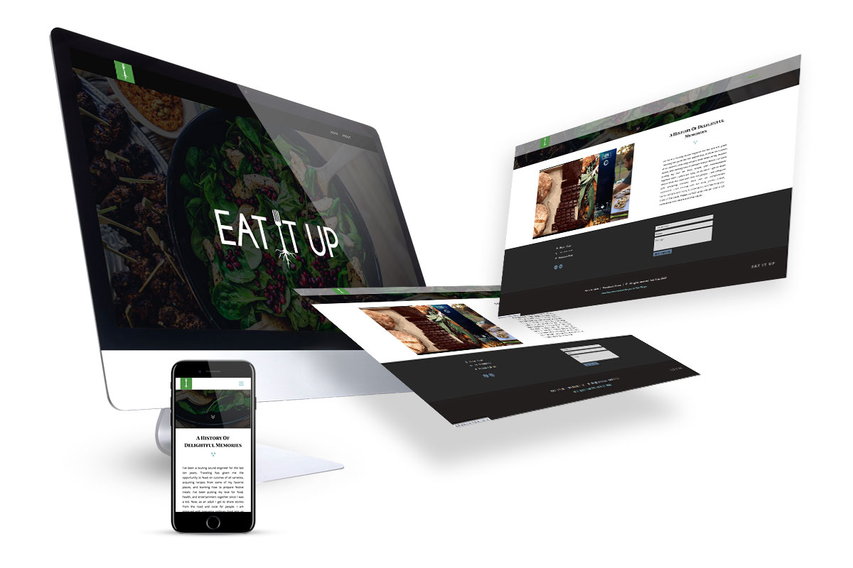
- Website Development
SOME DETAILS
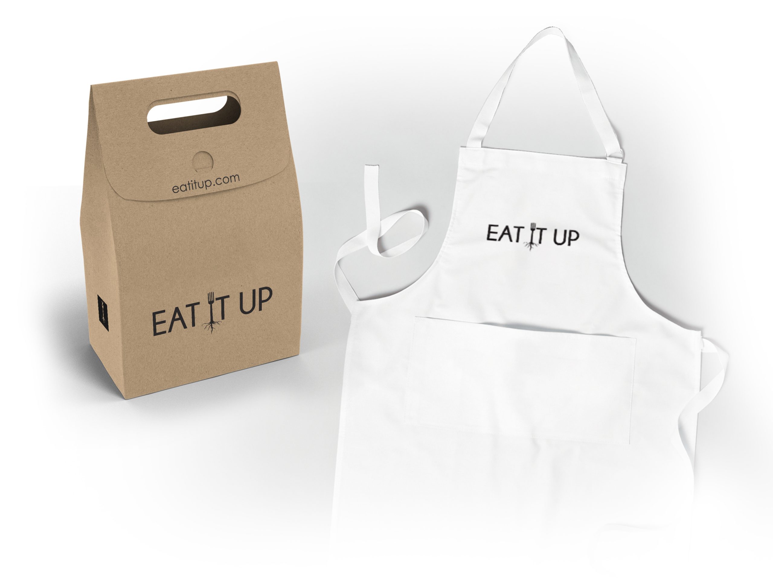
Eat It Up is not only a service but also a brand. They create take home meals as well as hand made chocolates from locally sourced ingredients to help support their community.
They wanted something very clean and simple but that also told the story of their philosophy. The green fork growing roots works so well with all aspects if their branding. The end results is a modern brand that can develop with their company as it continues to grow.
